Fashion District Philadelphia: A Work-in-Progress Review
In a three-year reimagining, the owner of the faded Gallery took on all the problems that had befallen the Center City mall. Did it fix them?

This temporary mural expresses PREIT/Macerich’s hope for the Fashion District’s future. | Photos: PREIT unless otherwise noted
While the shopping mall as we have come to know it may not be dead yet, malls are either dying or on life support in cities large and small. Between big-box stores, online shopping and the resurgence of Main Street, mall owners find they need to either find profitable niches or rethink the entire mall experience if they are to survive.
Which means, for most malls, either Go Big or Go Home.
Big is a mall like King of Prussia that has captured the high end of the market in Greater Philadelphia and beyond. These super-regional malls offer retail experiences not matched anywhere around them, often with additional features like indoor amusement parks thrown in.
Home is what some mall owners have added to their no-longer-purely-shopping centers, along with offices and entertainment. These malls, like Granite Run outside Media and Voorhees Town Center in South Jersey, have in effect de-malled themselves – literally: parts of their guts have been removed to make way for ersatz Main Streets, offices and apartments, and in the case of Voorhees, the municipal government.
A pioneering urban mall finds itself in a predicament
The Gallery at Market East had been hailed as a savior of Center City retail when it opened in 1978. But as its 40th birthday approached, it found itself in the same predicament as those suburban malls. It faced multiple challenges to its survival:
- The loss of its original anchors cut off large swaths of the mall from the traffic it needed to attract desirable tenants, leaving the forlorn top level to the likes of dollar stores.
- The mall in its later years developed a seedy reputation, not entirely deserved. Most of the seediness came from the declining quality of the upper-floor tenants, but some non-patrons ascribed it to the large numbers of teenagers who hung out there most every afternoon.
- Finally, urbanists hated the Gallery because of the blank face it presented to Market Street. The blank walls and lack of street entrances, they said, helped deaden one of the city’s main shopping streets.
Thus PREIT, the mall’s owner, found itself with a slowly dying hulk of a mall with three big millstones around its neck. Which should have made it a prime candidate for de-malling and replacing with an ersatz Main Street.
There were some problems with taking the Granite Run approach here, however. One was cost. Another was that there was already an actual Main Street running alongside the mall.
So PREIT went to work tackling the three issues within the existing building envelope.
The answer, jointly developed with Macerich, opened to the public last Thursday: Fashion District Philadelphia, a project that took longer than either partner planned and still isn’t completely finished yet.
How did PREIT and Macerich do in addressing the three issues?
Let’s start with the de-malling.
Downsizing rather than de-malling
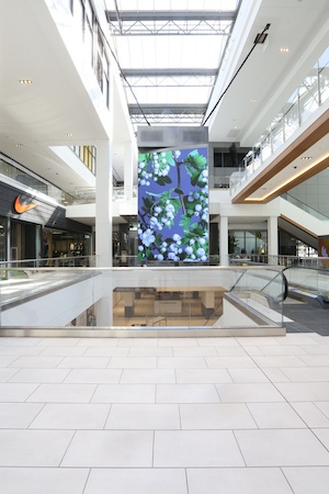
The rotating digital display in the mall’s center entrance court.
Even though the Gallery contains building pads atop which towers can rise, PREIT/Macerich opted not to add “live” to the live/work/play mix. But in adding the “work” and “play” parts, they also solved – or hope to solve – the problem of the orphaned top floor.
In the original Gallery space, the top-level concourse is being transformed into two co-working spaces. One, Industrious, is standard co-working along the lines of WeWork, while the other, REC Philly, aims to meet the needs of the city’s community of musicians, artists and other creatives.
The top level of the former Gallery II is where PREIT/Macerich is concentrating the “play” elements. The top floors of the old JCPenney/Burlington will house an AMC cinema – the first new first-run movie theater in Center City in almost 30 years – while the rest of the top level will house Round 1, a family-oriented bowling alley and amusement center.
Assuming the workers and pleasure-seekers come, this may be the most successful of the attempted fixes.
Improving the flow through the mall
In between these two ends, the old Gimbels/Clover/Kmart space has become part of the mall proper, thus improving the flow of patrons through the entire complex.

The main atrium of the original Gallery, looking towards the former Gimbels/Clover/Kmart. | Photo: Sandy Smith
In reconfiguring the mall, PREIT sought to make it easier to navigate in other ways. “One of the issues at the Gallery was, you could see a store on the other side but you couldn’t get to it,” says PREIT CEO Joe Coradino. “We put in connections where you can get from one side to the other without having to go back to the escalators.”
There are also more escalators: a new set has been added in the center of the mall.

The new central section of the mall. | Photo: Sandy Smith
The mall also received a makeover that booted beige and red brick and added white walls, marble floors and brighter lighting. It also added a huge digital sign just inside its main entrance and $1 million worth of permanent public art.
These changes certainly make the Fashion District look and feel more up-to-date and uplifting than the Gallery. That alone might bring lost shoppers back.
Improving the connections to the street
Perhaps the most significant change made to the mall, aside from its new main entrance, is the addition of two large entrances on the Filbert Street side. Preliminary project renderings showed this street filled with life from the restaurants that would front it, and PREIT clearly wants to turn this street from a back alley behind the mall to a pedestrian magnet all its own.
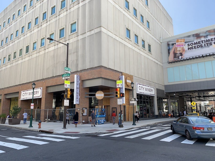
The entrance to City Winery at 10th and Filbert, taken on Monday, before the official opening. | Photo: Sandy Smith
To help this process along, one of the major dining and entertainment venues, City Winery, has its main entrance at the southeast corner of 10th and Filbert streets. Outdoor seating will occupy the space along the Filbert Street sidewalk between the 10th Street corner and the eastern Filbert Street entrance to the mall.
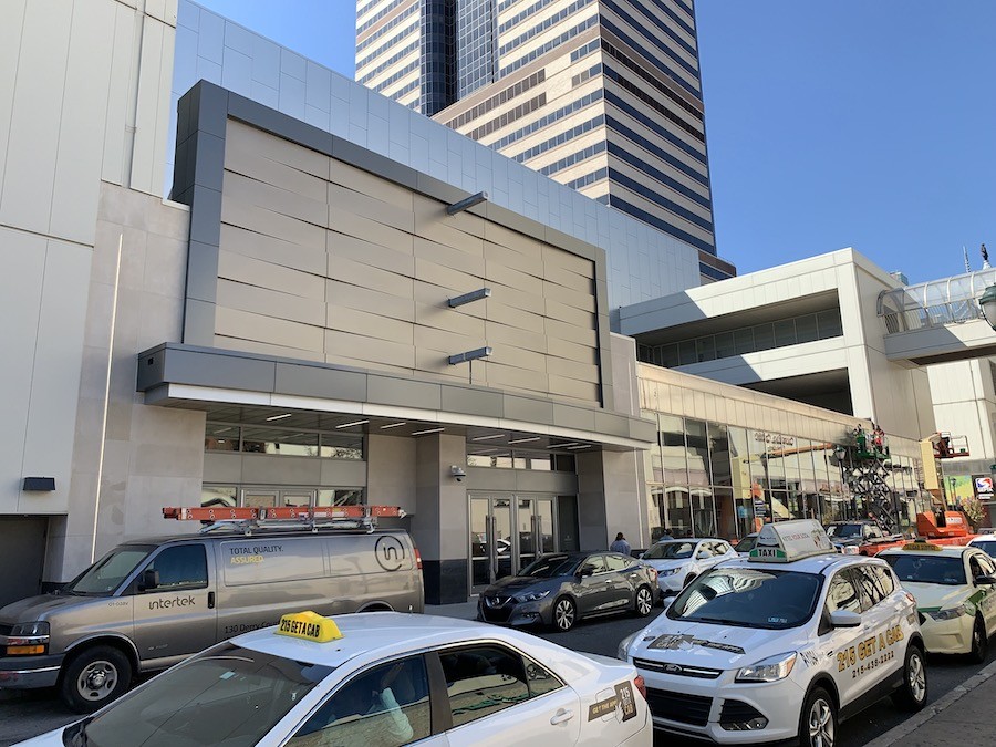
The new mall entrance in the 1000 block of Filbert Street. | Photo: Sandy Smith
Another main entrance, near the 11th Street end, got the same undulating metal panels that now cover the exterior of the old JCPenney/Burlington upper floors. A projecting sign mount suggests this will become a main gateway to the theater and amusement center.
Unfortunately, all this can only do so much to reanimate Filbert Street, and one of the other key elements that remain explains why. The light well for Jefferson Station fills most of the 1000 block, which prevents any new street-facing activity there.

The entrance to the H&M flagship store at 10th and Market streets. | Photo: Sandy Smith
More interfaces with Market Street
Meanwhile, all of the stores with Market Street frontage now have Market Street entrances, including the mostly-below-ground Burlington. The new flagship H&M at the northeast corner of 10th and Market feels like an anchor department store upon entry: it spans all three levels of the mall at that point.
New billboards, some digital, have also been added to the Market Street façade as well as the bridges spanning 9th and 10th streets. These are meant to enliven the street as well, much as the digital billboards on the neighboring East Market complex do.
And the old sunken main entrance has been replaced by a large glass cube with a metal overhang.
Yet while the added windows and entrances do make the Market Street side of the mall far less forbidding, it’s not clear whether these will truly animate the street the way the more varied streetscapes do on the other side.
Nonetheless, Coradino says, “The Gallery presented itself as defensible architecture. It doesn’t do that anymore. Where the old Gallery had only three entrances, we now have 20.”
An effort to “upscale” the patrons?
But on the train level, the designers did put in some “defensive” elements – aimed mainly at making the mall less conducive to just hanging around all day. Because of its location astride the hub of Philly’s rapid transit and Regional Rail networks, the Gallery became a favored gathering place for many African-Americans, young and old alike, who could access it easily from outlying city neighborhoods. Their presence caused many whites to consider the Gallery an extension of what Yale (and former Penn) sociologist Elijah Anderson termed “the iconic ghetto” — a place that, because low-income blacks use it, becomes an extension of the low-income black neighborhood and thus undesirable in the minds of others — in his book “The Cosmopolitan Canopy” (2011).
The biggest “defensive” move was the removal of the old eastern food court, a recessed space off the lower-level concourse. Meanwhile, the western one, which is directly connected to Jefferson Station, got an upgrade. The ceilings are higher in that space now and the seating more out in the open, which may reduce the number of people from nearby neighborhoods hanging out during the day.
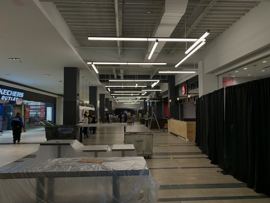
The Market Eats food court being prepared for Opening Day. | Photo: Sandy Smith
In terms of removing the “iconic ghetto” stigma, it appears PREIT intends to do that in the mix – the mix of tenants, that is. While the roster of stores disappointed both those who hoped for a little King of Prussia magic in Center City and those who yearned for a high-end-bargain-hunter’s-paradise outlet mall, there is a decent mix of mid-market retailers along with several businesses that are new to the city, and others, like City Winery and Round 1, that are new to the region.
(There are also four specialty boutiques owned by local designers in a section of the train level dubbed “Uniquely Philly.” Their location seems something of an afterthought; I hope they draw the attention they deserve.)
The aim, then, is less to discourage the teens from visiting than to dilute them in a flood of other shoppers from more varied backgrounds. If the mix of shoppers on opening weekend can serve as any guide, this might work, but the real test will come in the afternoons during the school year.
Besides, the teens may not represent a real problem after all. As a reporter of my acquaintance put it during the media tour, “they already go to King of Prussia and spend $400 on Louis Vuitton handbags.” So maybe that particular problem is more one of perception.

The Conrad Benner-curated murals on the train level.
Do we deserve it?
Which brings me to one of the new mall’s temporary features: a series of murals and artworks installed on the train-level concourse and curated by StreetsDept’s Conrad Benner, the celebrator and chronicler of the city’s street art. These provide much of the non-promotional pops of color and showcase the diversity of younger artists currently at work in the city. If the new mall management is wise, it will turn this temporary design element into a permanent rotating feature of the space.
One of the works on display offers a critique of sorts of everything going on around it: a large backlit sign by Chad States that reads, “You Deserve It!” After all, that’s the message every retailer here sends out to the would-be customers.
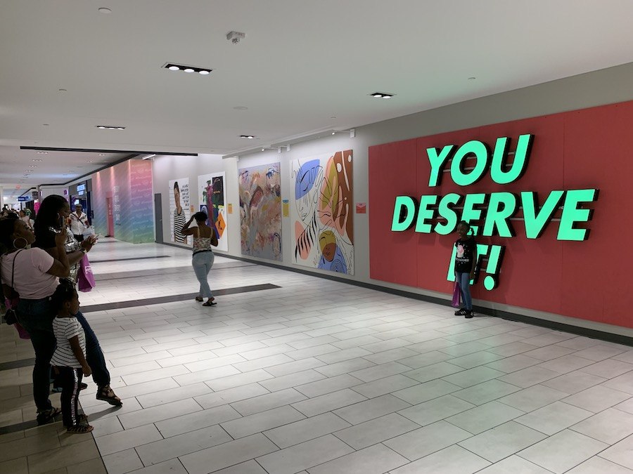
A shopper photographs her daughter in front of “You Deserve It!” on Saturday, one of several who shot photos at the mural. | Photo: Sandy Smith
But what, this work asks, is it exactly that we deserve? Do the old folks who used to call the concourse food court home deserve to be forgotten? Do we deserve not to have our sensibilities shaken by the Others in our midst? Do we shoppers deserve this spiffed-up space? Does Market Street deserve a little more than appliquéd doors and billboards? Does Center City deserve more than a mall-not-mall?
This being a work still very much in progress, we can’t say for sure what the answers are, or even whether these are the right questions. But at least we can contemplate the whole ball of wax while sipping locally made wine and craft cocktails from City Winery’s concourse-facing bar before we catch the Regional Rail train home.
Updated Sept. 24th, 7:07 p.m., to correct the name of Burlington (formerly Burlington Coat Factory).


