Room of the Week: A Punch of Personality You’re Going to Love

Photo courtesy of Henck Design
Black is always the new black, or so we thought. Earth-tone enthusiasts, we were shocked to fall head-over-heels for these fresh and funky finishes. Goodbye black; hello blue! Bright and bold looks like the way to go.
Personality is all over this pad. This room comes to life with vibrant details yet somehow stays sleek and sophisticated–but how? Lucky for you, we have the lowdown on what interior design maven Christina Henck has to say about making your home a hip–and happy–place. Find out how to get the look below.
The Details
Designer: Christina Henck of Henck Design
Project location: Fishtown
Design goal in six words or less: Chic and contemporary that feels like fashion
The Scoop
That accent wall is daring…but it’s amazing! Why was wallpaper the way to go here?
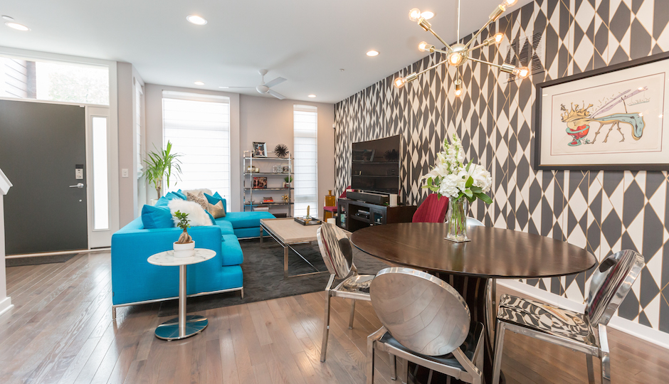
I always say that my style doesn’t matter, the client’s style does. The wall is a risk, but these clients were certainly not risk-averse; their personalities were like sunshine and we wanted to show their bright, fun and funky disposition in the home. We pushed the envelope. The geometric wallpaper was in line with the modern motif. The black, white and gold in the room paired with the mixed metals help it all come together and look super chic and sleek. The wallpaper played off of the gold chandelier and chrome accents.

Photo courtesy of Henck Design
I would never think to go for a blue couch…too scary! But in this room, it just works and it’s not overbearing. How do you decide if a risk will be worth it?
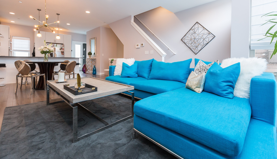
Calculated risk is in everything. There is calculated risk in business. There is calculated risk in design. there is calculated risk in a blind date. But, you always take it the risk. The question is, what kind of risk are you going to take? In this room, it was all about balancing elements. The floors and walls are shiny and neutral, and while the couch is bright, it has a smooth and simple fabric. The rug balances out the bright pop of color by adding texture and pattern–it creates layers. If the floors were white marble, the couch wouldn’t have worked. The dark floors anchor the couch. Anyone can make a risky piece work as long as they balance it out with the type of wood, metals, upholstery and greenery. You want to make a cohesive space.

Photo courtesy of Henck Design
There’s different colors, wallpaper and mixed metals in this space, yet, it still feels clean and minimalistic. How did you balance taking a space bright and bold without making it too busy?
Large circulation space is important, especially in the city. Your neighbors are on top of you and it can feel cramped. Homes are your sanctuary, a space to clear your head. I don’t want to create a cluttered space — you naturally do that on your own; life happens! It’s so important to use the right scale furniture in your home. The value of having a designer is that they know whether you need a 120-inch sofa or an 80-inch sofa. Picking out sizes, patterns and textures are all part of the design process. This space is in a new construction development by The Riverwards Group, the Residences at Fillmore.
What advice do you have for someone trying to inject personality into a room?
Take a risk! Commit to a color. A rug is a really good way to add texture and color. People are afraid of furniture, but you can always replace a rug. It’s not a huge commitment or investment; a rug has a natural lifespan of only 15 to 20 years. If you go with a grey sofa, throw in a geometric rug. Then, match the color of the rug and put a fun throw pillow on the couch–instant personality! Green plants are another option. Committing to nature is always going to look good; it’s intrinsically perfect.

Photo courtesy of Henck Design
What was the biggest design victory for the space?
Definitely achieving balance among strong elements. There is a 35-foot stretch of wall with geometric wallpaper, a gold chandelier and silver chairs. Then, we pulled off a magenta chair right across from a turquoise couch. It feels high fashion! But most would have settled for a white chair.
Check out more of Christina’s work by checking out her website and following her on Facebook and Instagram.
Have an amazing room you think should be featured? Send photos and a brief description — including location — to eleaman@phillymag.com for consideration.


