Room of the Week: A Dreamy Old City Dining Room With Ceilings for Days

Photo by Andrea Cipriani Mecchi Photography
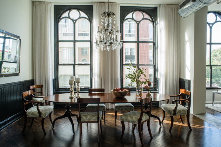
Imagine with me, if you will, the amazing dinner parties you could have in this Old City dining room. I can’t help but place myself right there at the head of the table, full-on fabulous Great Gatsby attire, with a long smoldering cigarette between my fingers, while I entertain my guests with my wit and charm. I don’t even smoke, you guys, and I’m probably not that charming, either.
But doesn’t this dreamy dining room just make you want host the most fabulous parties, with the light from that pretty chandelier glinting off your champagne flute?
In this week’s installment of Room of the Week, I got the skinny on how this pretty dining room came together. Pay attention, people. There’s plenty of design inspo to crib here.
The Details

Photo by Andrea Cipriani Mecchi Photography
Designer: Michele Plachter of Michele Plachter Design, based in Washington Square
Project location: Old City
Design goal in six words or less: Relaxed glamorous loft, Old Hollywood vibe.
The Scoop
How long are those curtains? They’re insane!
Those curtains are 11 feet long. We have access to so many amazing fabric manufacturers that finding the perfect sheer fabric for drapes like this is no problem.
Dark wainscoting is a trend I’m seeing everywhere. Why does it work here — and when doesn’t it work?
Black molding against crisp white walls is fashion-forward yet timeless (think Chanel) and works in so many spaces. If there is natural light, it can be a perfect fit. We love creating drama in unexpected ways, yet in a space like this, we wanted to elicit a feeling that it may have always been there. If the room tends to be naturally dark, I would advise keeping the moldings crisp and light, with the exception of wanting to create a moody dark room. It takes guts to use strong colors. Black is an amazing color, but many people can’t envision it in interiors. We recently did a kitchen with black cabinets. It’s killer!
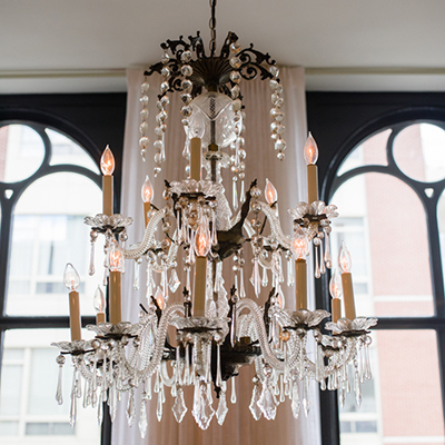
Where’d you find that dreamy chandelier?
Isn’t it dreamy?? It was my client’s mother’s chandelier that was passed down to her. It’s very special to her and we wanted to insure it was front and center in the design.
Is that table an antique?
The table and chairs are antique. The chairs were recovered in a modern print to give them an updated stylish appeal.
What’s the story behind the mirror?
We love incorporating clients’ own treasures and heirlooms into our designs when appropriate. We were very fortunate that this client had many items that worked perfectly in the space, including her mirror.
This room is rather minimally decorated — which is why it’s so simple and pretty. How do you avoid the trap of over-decorating, and how do you know when to stop?
In an amazing space like this one, the windows, lighting and furnishings speak for themselves. We didn’t want it to take away from the architecture in any way. We curated just enough accessories to have the space feel finished yet lend itself to casual elegant living. I look at room accessorizing like putting on my own jewelry: Once I have all of the jewelry on that I like, I take one piece off. It’s perfect.
Have an amazing room you think should be featured? Send photos and a brief description — including location — to eleaman@phillymag.com for consideration.


