Toll’s Tower Design: An Almost Successful Compromise

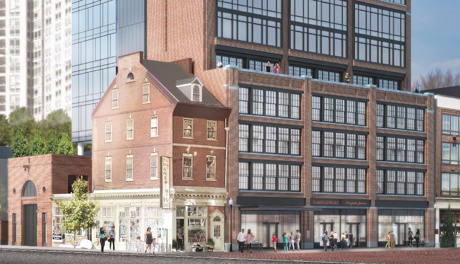
The Sansom Street elevation of the proposed Toll Brothers condo tower. | Rendering: SLCE Architects
Given that the controversial condo tower Toll Brothers City Living plans to build at the east end of Jewelers Row is a by-right project, it really wasn’t necessary for the company to meet with neighboring building and business owners to discuss its plans. But it did, and given what it was proposing to build and where, the natural question those neighbors, both supporters and opponents, had was: Well, what will the thing look like?
A lot of other people well beyond Washington Square West wanted to know too.
We all got that question answered at last Tuesday’s meeting of the Washington Square West Civic Association Zoning Committee, where representatives of Toll Brothers’ City Living division and the project architect, New York-based SLCE, revealed renderings of the tower.
The result is a good news/bad news story. The good news? The architects did a really good job of studying the building’s surroundings and coming up with a tower design that respects its context. The bad news? Even though it’s exactly the kind of building we need more of in much of the city center, it still looms over the historic streetscape it will join – and claim some of that history in the process.
Let’s deal with the good parts first. The best part is the three-story base atop which the tower rests. Even in its more modern version, the base’s facade is divided into three parts by brick columns that replicate the rhythm of the window bays on the building to its west. The more traditional facade Toll prefers replicates that building more faithfully by adopting the language of early-20th-century industrial architecture: more brick in the columns and parapet, mullioned windows on each floor. Either way, the design works beautifully, and the fact that some Jewelers Row owners liked the modern one better shows that past, present and future can continue to blend, as they must in any living city.

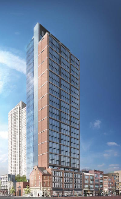
The tower from the northeast
The tower above continues the three-part division with brick separators on its north face. This more modern interpretation of early-20th-century loft factories is handsome, but as I looked at it, I also caught a whiff of something else: the elongated 1927 Georgian Revival tower at 17th and Chestnut that once housed the headquarters of Provident National Bank, perhaps the most curious skyscraper ever built in the city and the primary example of applying an inappropriate style to a tall building. This is still far from that, but as one Wash West resident noted at the meeting, you usually don’t find brick columns extending that far up.
The south half of the tower attempts to pull off a bit of architectural sleight-of-hand: it’s covered entirely in mirrored glass. The intent, or at least it seems to me, is to make the tower disappear when viewed from the south or Washington Square.
That’s something the architects should have considered for the north side instead. And that brings us to the bad-news part of the design.
The developer and architect made much of the tower’s slenderness in their presentation to the WSWCA. Unfortunately, the slim sides are those on the east and west. On the north and south, it’s much wider. The large expanses of glass on the north-side bays mitigate the effect a bit, but the north facade remains a slab that will loom over low-rise Jewelers Row, and the brick columns make that slab look more massive.

View of the tower from the south
It might have been a better idea to make all of the tower glass, even though glass towers are becoming pretty common hereabouts. Doing so would have lightened the weight of the tower on all sides and reduced the imposition, if not the shadows, it will cast on the 700 block of Sansom.
Of course, none of this addresses the question of the site itself, which remains problematic. It’s not that tall buildings and short ones cannot peaceably coexist: as Toll City Living Vice President Brian Emmons pointed out, the even taller St. James does so about a block to this tower’s southwest. But as the preservationists have pointed out, Jewelers Row is an ensemble that evolved over some two centuries, and plopping a tall tower in the middle of it alters it, maybe beyond salvage. There were other sites in the immediate vicinity Toll could have considered for its project, in particular a large surface parking lot on the north side of the 800 block of Walnut. Even buying some of the similarly low-rise 19th-century structures on the north side of Walnut’s 700 block might have been preferable, though as an ensemble those buildings are far more intact and coherent than those William Sansom originally built on the street that bears his name.
Still, on the whole, given what might have gone in the space Toll wants to fill with condos, what SLCE has produced to realize Toll’s goal is an effort worthy of two cheers, if not three.
Follow Sandy Smith on Twitter.


