Popkin on New MAR Design: Still Mired in Conservatism

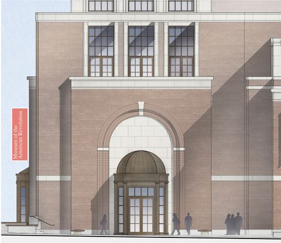
“This, I think is most telling about how little this design has moved from mimicry, from its deep, deep conservatism,” says Popkin about the way the museum will meet the street. Rendering via Museum of the American Revolution website.
We asked architecture critic Nathaniel Popkin to comment on the redesign of the American Museum of the Revolution that was approved yesterday by the Philadelphia Art Commission. Popkin has been the most outspoken critic of Robert A.M. Stern’s design for the museum, though he has certainly not been alone (“it’s controversial for its shittiness,” he notes).
After a look at the new renderings, which you can see in a slideshow below, Popkin had to wonder just how much time Stern & co. spent “back at the drawing board” after the Commission requested a redesign. Here’s his assessment:
I know that members of the Art Commission took this quite seriously–they wanted to make this building better; and I think the Museum people tried in an honest, but also very limited way to address the concerns. It wasn’t probably ever realistic that the Art Commission would be able to force a real redesign. But they didn’t come close to getting one, despite the way the Inquirer framed the story this morning. And that’s what’s so frustrating.
Yes, the cupola is gone and there’s now an entrance on Chestnut Street. In the rendering they even now have the cars going in the proper direction. They removed the canons from the plaza (this isn’t 1976). But that’s it, really. In fact the building looks all the more like Stern’s Bush Presidential Library now. This is still an brick box that might be built anywhere, that doesn’t speak to the city around it and that isn’t at all inviting. That’s one of the surprises in this “redesign:” they clarified the detailing on the entranceways–and now the building feels ever more like a 1920s office building: it does nothing to draw you in from the street, into the story of the museum.
Unfortunately, now, they can declare victory, tell the world they’ve reacted to the city’s demands and still we’re left with an uninspired brick box that tells us nothing about the audacity and power of the revolution.
Meanwhile, his co-editor at Hidden City, Bradley Maule, has also posted about the MAR, saying “the design as a whole is far more goofus than gallant.”
All renderings via Museum of the American Revolution website.


