3 Gorgeous Wedding Palettes From Pantone’s Fall 2015 Color Report
Each year, we wait with baited breath to see what Pantone—you know, basically the upscale runway-version of Crayola—declares will be the Color of the Year, and how that will affect the upcoming seasons’ wedding trends. When we were introduced to Marsala for 2015, we figured it would serve as the inspiration for many an autumn bride, and looked forward to the pretty color schemes that would spring from the rich red-ish hue.
Thing is though, every season, the color intelligence team behind the expert brand actually releases an entire roster of shades that they declare should dictate everything from your wardrobe to your choice of lipstick, and we say that that, too, can inspire a wedding palette. After all, colors don’t have to fade away after one quick cycle of fashion; pretty colors can withstand a lifetime.
And so, we’ve taken a look at Pantone’s Fall 2015 Fashion Color Report, combined the shades we think would look best together, combed through Pinterest for you, and provided a few pictures so you can see for yourself how these beautiful hues can be trendy in any weather, of any year, for any bride. Be lost in the cold, dark world of choosing your wedding’s color scheme no more. Behold:

Inspiration photos gathered from Pinterest.
The Grand Romance: Marsala and Cashmere Rose
We’re kicking off with the big-hitter: Marsala, the 2015 Pantone Color of the Year. If there is one reason we wouldn’t want this year to end, it’s because we love this versatile, luxurious shade of burnt red as much as the wine it emulates.
So, we said no to putting it in the ground, and instead, placed it next to another Pantone pick, Cashmere Rose. The resulting product was a lovely monochromatic color scale that evokes as much romance as the institution of marriage itself. For brides who are planning an indoor wedding in the cooler months, try offsetting the hues with shimmery golds to create a lavish aesthetic. Ladies who are opting for the outdoors, or whose tastes are slightly less dramatic, pair the colors with soft greenery and natural wood to achieve a look fit for a Victorian garden celebration.

Inspiration photos gathered from Pinterest.
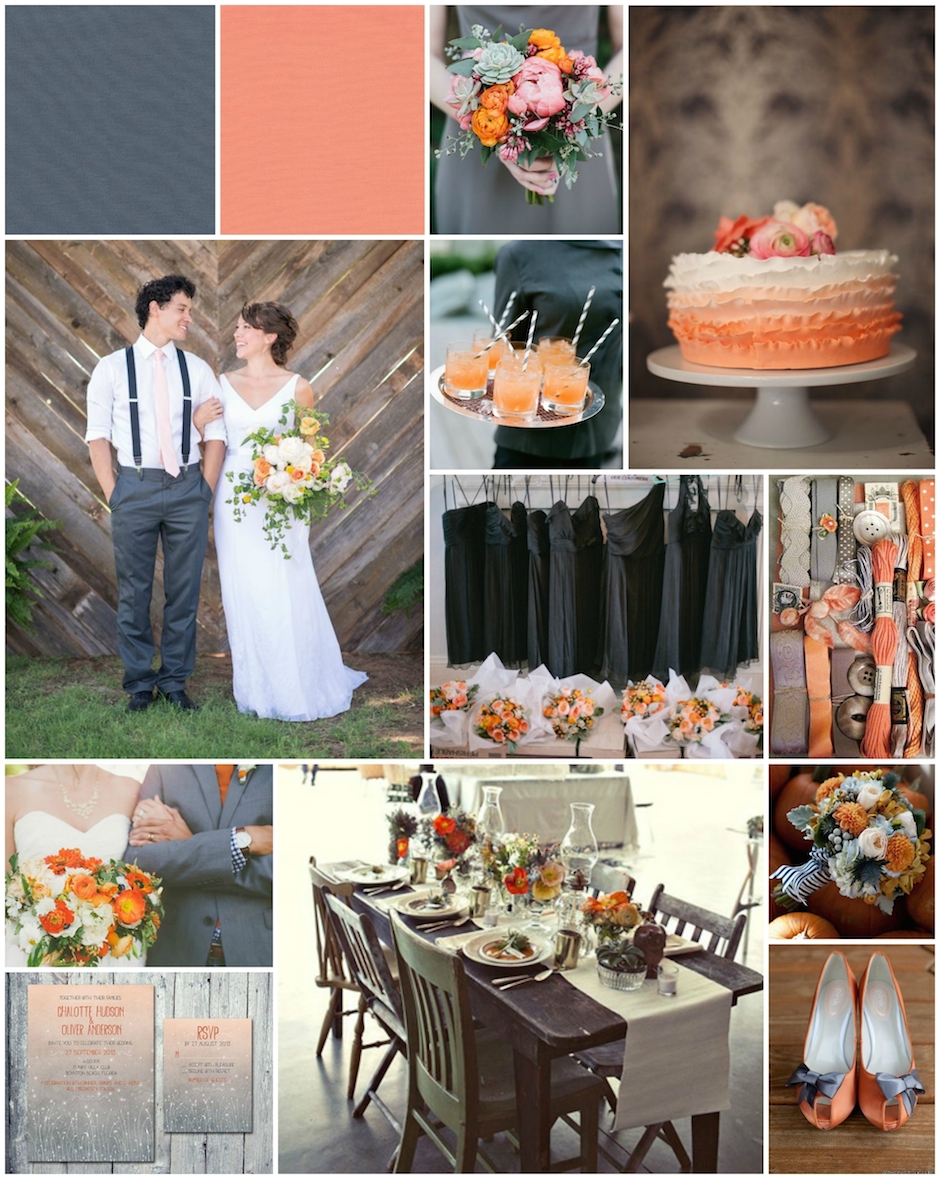
The Bold and the Whimsical: Cadmium Orange and Stormy Weather
If you’re looking for a palette that isn’t going to burn through the corneas of your guests or remind them of a funeral procession, then a soft orange-gray combo is the answer to all of your unspoken prayers.
Gray is as timeless and neutral as black, and can add a little wow factor without all of the saturation. But, when you take gray and put it with a brighter, louder tone, complementary magic happens—which is the exact reason we combined Pantone’s Cadmium Orange and Stormy Weather. Alone, the peachy-orange is reminiscent of the tropics, and the dark, bluish gray (as you may have already thought), similar to a raincloud. However, together, they are astoundingly weather-resistant, and well, just fun.
Unconventional flower choices, such as sprigs of lavender or orange peonies keep vibes laid-back and whimsical. Striped straws for cocktails and patterned touches on your groomsmen (like: we love this navy gingham under a gray suit), also tell guests that you are “the cool bride” no matter how many meltdowns you had during the planning process. Pro tip: Instead of going out of your way for gray, a venue that is already heavy in the hue is the perfect home for bright décor.

Inspiration photos gathered from Pinterest.
The Au Naturel: Dried Herb, Desert Sage, and Oak Buff
So, monochromatic scales are a little too drab for you, but jumping headfirst into stark contrast isn’t quite your thing either. Don’t fret, we—along with a basic color principle—have your back with something called an analogous scheme.
Now, this is just a fancy way of saying that you want similar, but different, colors present for your event. Luckily, Pantone’s list includes some low-key tones that work so well together, you’ll wonder if they’re naturally occurring. Turns out, as their names suggest, Dried Herb (an olive-y green), Desert Sage (a sage-y green) and Oak Buff (a golden tan) actually are! And while these three things aren’t exactly neighbors in the wild, they just belong with one another at a wedding. May we suggest taking the (almost literal) grassroots approach by going heavy on greenery and flowers in each of the respective shades, to give guests a rustic, “outdoors-in” experience that translates well through any season. Bonus: candlelight and/or wood touches are basically must-haves when using these colors.
And if this has got your mix-and-match skills clamoring for more, take a look at the entire list of Pantone picks, and tell us: Which would you combine for your perfect wedding palette?
Like PW on Facebook | Follow PW on Twitter | Sign up for the PW newsletter
Getting married? Start and end your wedding planning journey with Philadelphia Weddings' guide to the best wedding vendors in the city.


