City Map Shows Inequalities In COVID Vaccinations in Philadelphia
Rittenhouse Square, Old City and Washington Square West are getting the most. A different story is playing out in North and Southwest Philly.

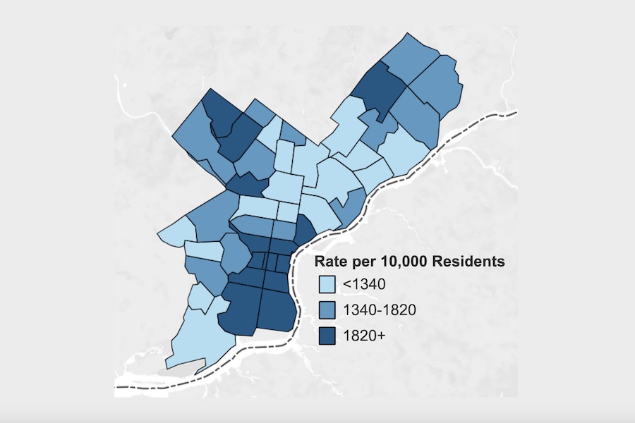
This vaccination map shows Philadelphia COVID-19 vaccine recipients by zip code (Image via City of Philadelphia)
A newly updated map published by Philadelphia’s Department of Health shows inequalities in who is receiving the COVID vaccine in Philadelphia.
The color code on the map indicates the vaccination rates in each zip code as of March 14th, based on residents who are partially vaccinated.
According to the city, vaccine rates are highest in neighborhoods like Fairmount (28.9%), Northern Liberties (23.8%), Fishtown (22%), Center City (averaging about 33% depending on individual zip code), East Falls (22.6%), Chestnut Hill (21%), Bustleton (20.3%), and all of South Philadelphia (ranging from 18.8% to 27.5%, with the rates increasing as you move north).
The zip codes with the highest rates of COVID vaccination of all are those which comprise the Center City neighborhoods of Old City (31.6%), Washington Square West (33%), and Rittenhouse Square (35.8%), some of the richest and whitest zip codes in Philadelphia.
The zip codes with the lowest COVID vaccination rates are 19142 and 19133 (both at 8.7%), which represent Elmwood in Southwest Philadelphia and a section of North Philadelphia that is the poorest zip code in the city, respectively.
The residential data is imperfect. Rates are based on overall population, including individuals under age 16, who are not eligible for vaccination. And the city also has no idea how many residents of a given zip code received their vaccination outside of the city — something that anecdotal evidence tells us people have done.
While Philadelphia officials have said only Philadelphia residents should be vaccinated here, the counties surrounding Philadelphia will (and do) vaccinate Philadelphia residents. Those counties don’t maintain any data showing where the people they vaccinate live. And the state doesn’t have any indication of this either.
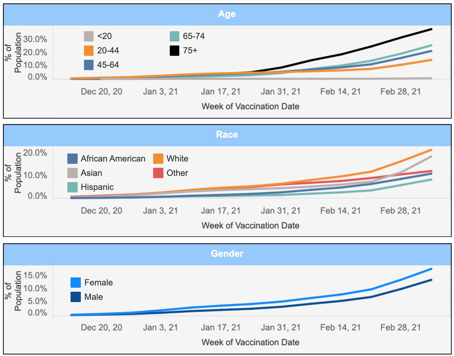
Along with the map, the city’s data shows COVID vaccinations broken down by race, gender and age. The vaccination rate among white residents is nearly double that of Black residents, as seen below.

The map and graphs will be updated on a regular basis as new data becomes available. You can access the most up-to-date information on the city’s website.
And if you want to know where to get the COVID vaccine in Philadelphia, consult our guide here.
This story has been updated to clarify the nature of the data provided.


