Check Out the Cool Patch of William Penn the Phillies Used to Have on Their Jerseys
Last night, I attended a talk at Fleischer Art Memorial about “The Art and Design of Sports Uniforms.” It was done by Peter Capolino, the man who turned Mitchell & Ness form a sporting goods manufacturer into the retro jersey fashion behemoth it is today.
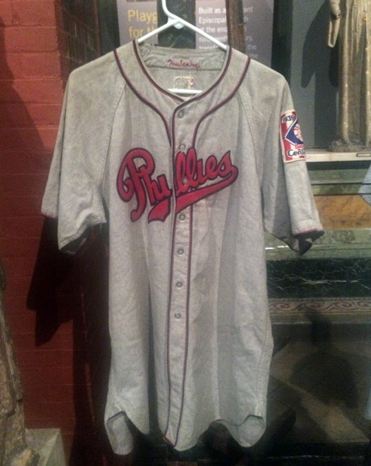
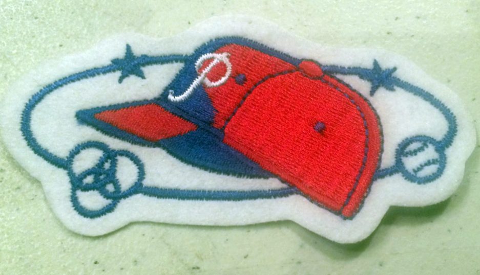
It was pretty cool! Did you know the team didn’t always have a ‘P’ on its cap? Or that baseball jerseys were so baggy because they were wool flannel and would shrink over the course of a season? Well, maybe you did, but I didn’t. What most intrigued me was the above logo, which the Phillies wore on the sleeve of their jerseys in the 1938 season. Though the Phillies wore a blue and yellow jersey to celebrate the tricentennial of the founding of New Sweden and lost 105 games, they did have this patch. Per Sportslogos.net, this patch was once the primary logo of the team!
I don’t think I’m alone in saying that the Phillies can salvage what’s looking like another lost season — perhaps not 105 losses bad, but bad nonetheless — by bringing this logo back. It has William Penn on top of City Hall pitching a baseball. What more do you need? Well, you do get more: An old-timey spelling of “base ball” and a field behind him. This needs to be returned to the regular rotation immediately.
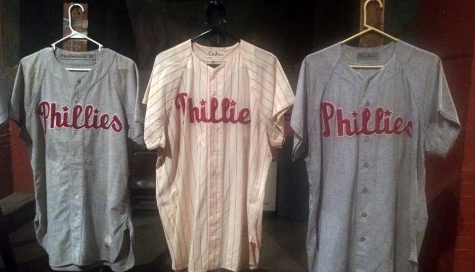
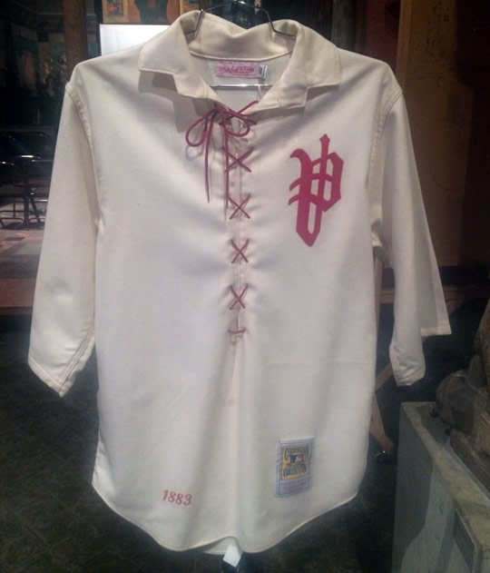
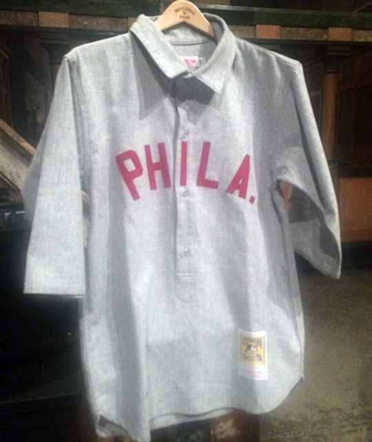
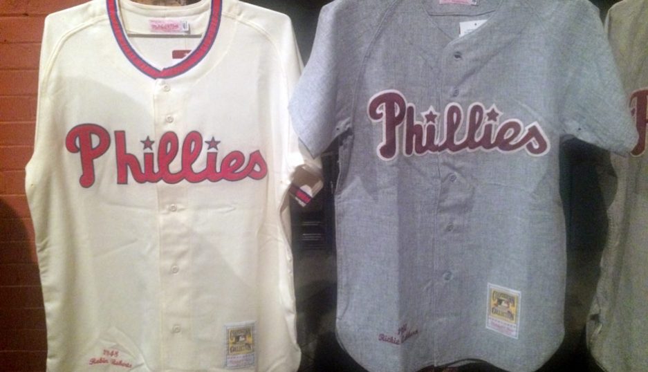
I took a few more photos last night.






Follow @dhm on Twitter.


