Philly By Color
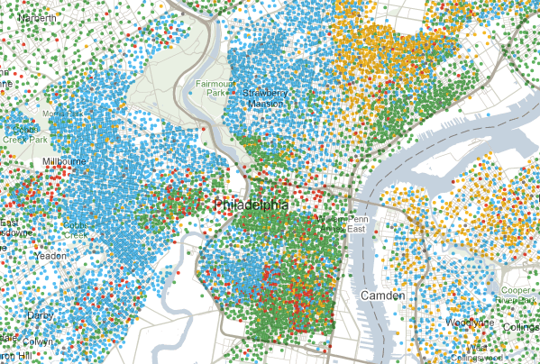
Courtesy of The New York Times’ Mapping America feature, here’s our city by ethnicity, based on the newest Census information: the green dots represent whites, the blue dots blacks, yellow dots Hispanic, and orange dots Asian.
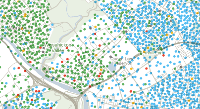
This is my neighborhood. Notice, if you can see that closely, the degree to which Wissahickon and US-1 act as a sort of racial dividing line:
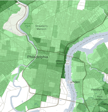
Here’s a similar map, breaking the city down by income (the darker your shade of green, the wealthier your section of town is):
One more: Here is our city by education. The deeper the orange, the higher the percentage that has a bachelor’s degree or higher.
