3 Philly Hotel Designers on Their Favorite Interior Design Trends
From wallpaper vs. wainscoting to how to make your home feel hotel-like, these three in-demand designers share their secrets.

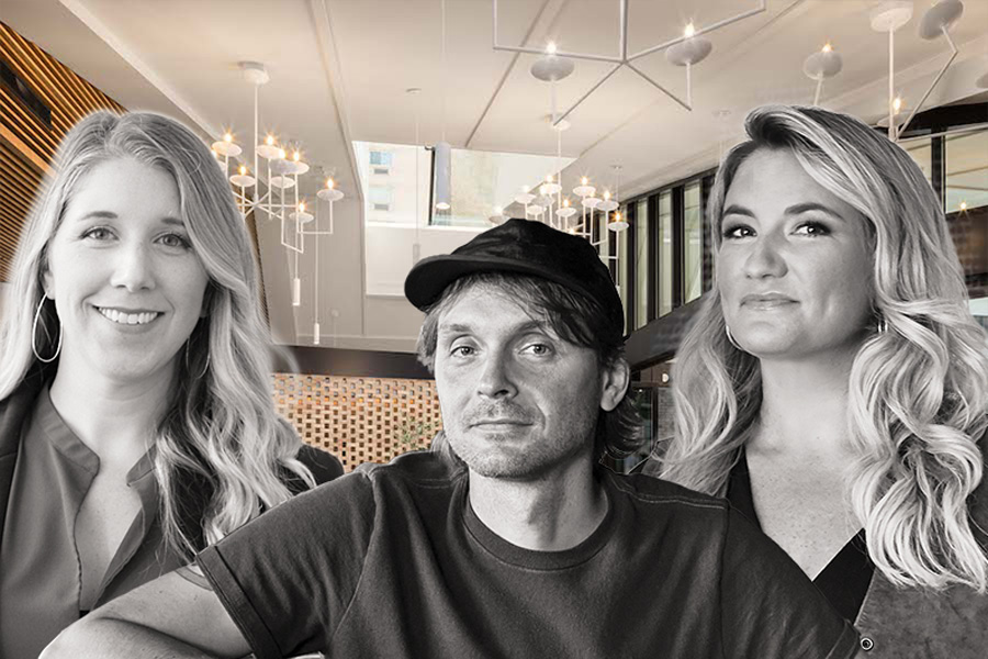
Philadelphia hotel designers Katie Pass, Lance Saunders, and Kate Rohrer. Background image by Pixellab via Pod Hotels, Photographs by Jason Varney; Trevor Dixon
Philly doesn’t just have great hotels; it has great hotel designers. Get to know three of the most in-demand.
Katie Pass
Hospitality design director, Daroff Design
Where you’ve seen our work: Loews; the Rittenhouse; Ritz-Carltons in Aspen and St. Thomas.
Hotel I wish I’d designed: All of the 1 Hotels properties.
Favorite paint color right now: Alabaster by Sherwin-Williams.
What’s great for a hotel but not for a home: A desk in your sleeping area.
Design trend I’m tired of: Too much technology in social spaces.
Seasoned style tip: Multiple sources of light at different levels assure there are no dark corners.
Brass or rose gold: Brass.
Florals or stripes: Stripes.
Neutrals or jewel tones: Neutrals, but add textures for interest.
High ceilings or hardwood floors: Both.
Lance Saunders
Director of design, Stokes Architecture + Design
Where you’ve seen our work: Pod Philly (cafe, restaurant, rooftop bar); River House at Odette’s (architecture); Le Cavalier at Hotel Du Pont.
Style philosophy: People crave familiarity, so we reinvent classics.
Hotel I wish I’d designed: Hotel Kinsley in Kingston, New York.
Favorite paint color right now: Waterbury Green by Benjamin Moore.
First thing I notice in a hotel: Floor material.
How I’d make a home feel more like a hotel: If you can afford it, housekeeping. If you can’t, nicer toiletries and bedding.
Wallpaper or wainscoting: Wainscoting.
Neutrals or jewel tones: Neutrals.
High ceilings or hardwood floors: Hardwood on the high ceiling.
Kate Rohrer
Founder, Rohe Creative
Where you’ve seen our work: Guild House Hotel (opening this spring); Houston’s C. Baldwin (lobby bar, restaurant).
Hotel I wish I’d designed: The Standard in London.
Favorite paint color right now: White Dove by Benjamin Moore.
First thing I notice in a hotel: How do I turn on the lights?
Design trend I adore: Being unapologetic about what you like. Also, handmade tile.
How the pandemic will change hospitality design: It’ll become more meaningful. People are aching to experience the curiosity and camaraderie of being in these spaces again.
Florals or stripes: Both. I love a good mash-up.
Chandelier or table lamp: Wall sconces.
Wallpaper or wainscoting: Wallpaper.
Neutrals or jewel tones: Depends on my mood.
Published as “Style Concierge” in the hotels guide in the April 2021 issue of Philadelphia magazine.


