The Design Inspiration Behind a Revived 107-Year-Old Hotel Restaurant
Le Cavalier at the Hotel Du Pont respects its architectural past while providing smart upgrades for its future.

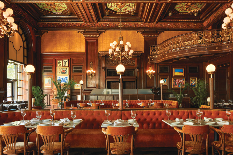
A look inside Le Cavalier at Hotel Du Pont. Photograph by Jason Varney
When Lance Saunders — the design director for Rittenhouse’s Stokes Architecture & Design — was hired to remake the 107-year-old Hotel Du Pont restaurant into a French brasserie, he knew the challenges would be many. “We wanted to make it attractive to a younger crowd without alienating the people who had spent their whole lives going there,” he says. The hotel, which was purchased by the Buccini/Pollin Group in 2017, is part of its multimillion-dollar investment in the area. BPG tapped Philly chef Tyler Akin, owner of Stock, to run Le Cavalier — the restaurant’s new name.
Saunders, who has done work for Starr Restaurants and La Colombe, started by updating the existing historical elements. Then he carefully layered in new seating and lighting and added a bar. “We didn’t want to make this look like Epcot by taking old details and replicating them,” he says. “We reinterpreted new elements in a slightly modern way to signify that this is an old space that’s progressing.”
Lighting
Saunders installed globe bulb covers on the old chandeliers and sconces to make them less “Grey Gardens.” The new custom post lights are common in French brasseries.
Walls and Windows
Saunders cleaned up the oak paneling and kept the existing gold wallpaper, which was added in the ’80s. He updated the tops of the windows with fabric and wood details and removed heavy drapes. (Not pictured but worth noting: The restaurant had carpeting, but while combing through the Du Pont archives, Saunders noticed a stunning marble mosaic floor that he was able to unearth and restore.)
Seating
The new banquettes were upholstered in orange velvet “to bring out the warm tones of the oak paneling.”
Art
Instead of adding turn-of-the-century American art (think oils of foxhunts), Saunders leaned into the restaurant’s new theme and incorporated French Abstract Expressionism: “It’s a nod to Paris, and it’s also something a little less expected.”
Published as “Like New” in the November 2020 issue of Philadelphia magazine.


