Revealed: Here are the Early Plans for the New-Look Headhouse Square

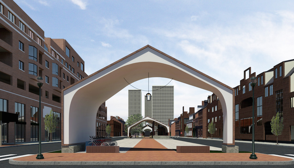
Conceptual design of the new-look Headhouse Square | Renderings via Ambit Architecture and South Street Headhouse District
It looks as though the long-talked-about renovation of the plaza at Headhouse Square is gaining some serious momentum. We were able to get our hands on a few conceptual designs, which show a flatter, median-free parking area towards South Street, some greenery and, more dramatically, the addition of two building–a pavilion/gateway at South Street and a cafe/information center adjacent to the recently revamped fountain.
Michael Harris, executive director of the South Street Headhouse District (SSHD), said organizers have been working on a plan that is similar in nature to one that dates back to 2006-2009. At the time, Center City District had updated the fountain and hinted at the notion of placing a cafe on the plaza, not unlike the experience at Sister Cities Park on Logan Square. “We just wanted to pick up on the work that was started with Paul [Levy of Center City District] and Center City, update it and refresh it now that it’s 2015.”
Due to a grant from the City Commerce Department and Councilman Mark Squilla, SSHD has the funds to go through the design and engineering planning phases at this point, although not construction. They’ve teamed up with Ambit Architecture, whose office is across the cobblestone street from the iconic Headhouse Shambles, to create a conceptual design of what Headhouse Square might look like in the not-too-distant future. “Not just to do it as a design exercise,” noted Harris, “But to bring it to fruition.”
The idea is to create a more flexible space that acts as a gateway through the plaza and into the Shambles, creating the larger, and better connected, Headhouse Square. “We utilize that space a lot, but it’s not particularly attractive,” said Harris, referring to the downtrodden stretch from South Street to Lombard Street. The top priority of the project would be to improve the overall safety of what amounts to a parking lot. That means better lighting (possibly cable lighting to create a “plaza effect”) and the implementation of a design aimed at calming traffic (buffers, curbs, etc.) in the area to make it safer for bicycle riders and pedestrians, alike.
Hoping to create the presence of a gateway, the first building at South Street is more of a shade structure during the day and well-lit pavilion at night. Early designs show it could possibly become the shelter for the Indego Bike Share station and Harris said it could have a “band shell” type usage for live entertainment during one of their many events.
The cracked and crusty median would be leveled and replaced with a pathway that leads through the plaza, preserving the well-designed axis and access of the original layout. There would still be dedicated parking spaces, but it would be a far cry from the Wawa parking lot we’ve all come to know over the years. Early plans whittle the number of spaces from 44 down to about 28, though that number could change, and it would be easier to make it a no parking zone during events. As Rich Villa, partner at Ambit Architecture put it, they’re essentially creating “a removable parking lot.”
In doing so, the new space would create a more usable, free-flowing layout for, say, extending the wildly popular Farmers’ Market all the way to South Street, providing much-needed elbow room to grab your farm fresh produce and products.
Splashy fountain spaces are all the rage these days, and the LED-lit jets at Headhouse have become a destination for families and those looking to cool off. The second building would be designed to work in tandem with the fountain, providing a place for people to sit and grab some shade during the hot days under a large Sycamore tree. Again, going along with the theme of flexible spaces, early concepts have this building pegged as a coffee shop/cafe with an information center.
As for the design, Jason Birl, partner at Ambit Architecture, said that the overall aesthetic seeks to “mimic or allude to the original Headhouse structure, but obviously in a much more contemporary way.” As such, they’ll be utilizing many of the same materials as seen on the Shambles, including white plaster on the underside of the looping arches and red slate shingles that flow from the roof down to the facade, a nod to the red brick and slate roof of the longstanding marketplace. Both buildings would look to create an extension of the Shambles, and Villa said they intend to use the same historic lanterns that are seen in the Shambles under the canopies of the new buildings: “There will still be all those lanterns in a row,” added Villa.
Sure, it’s early days for the project, but Harris seemed confident that the ball is steadily rolling towards actually implementing the plan. Though some still have questions about the project, Harris said that feedback and reaction from city agencies, near neighbors and businesses has been “favorable” to the overall designs. Best case scenario would be to start work on the lighting improvements and traffic calming features “sometime in the next year,” and ideally, that would include the construction of the two buidlings, but it’s very much “funding dependent” at this point.
“We’re thrilled we’re this close to bringing it to fruition,” said Harris. “Our intent is to create a really unique and inviting public space in the South Street District.”
Both Paul Levy and Councilman Mark Squilla were not available for comment at the time of publication.


